

Less than two weeks into my role at Aspiration, I was granted an enormous challenge: design the 2014 Aspiration t-shirt. From this high-profile task emerged a series of challenges.
The first was simple: how could I support free and open software and produce the kind of visual graphics I’m used to getting with proprietary tools? As a long-time supporter of the philosophy of free and open source, but a newcomer to many of the actual tools, here’s a walkthrough of the tools I explored and ultimately chose. You can also view the toolbox here.
Picking the Right (Free and Open) Tools
If something is free or open, that means it was designed and built to enable participation. This implies that anyone can use the program for any purpose, they can study how it works (the source code) and make changes, they can redistribute the original, and redistribute their improved version.
At Aspiration, we try to support these four freedoms by prioritizing the use of free/libre/open source software, open-licensed data, and open-licensed content.
The tenets of free and open software are a common theme in our manifesto and our friends’ manifestos. But in my experience as a student and professional transportation planner, I’ve more often encountered closed tools than open tools. As a result my digital tendencies gravitate towards proprietary software, and those are the ones I’m more comfortable using. So my first challenge was to step into the realm of FLOSS and use as many free and open tools as possible.
Developing the Design
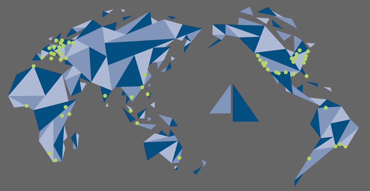
You could say another challenge was coming up with the design, but this was the fun part. I first turned to the visual collection and sharing site Pinterest. Pinterest may have a reputation for hipster wedding planning, but it’s also a great place to bookmark and sort anything visual you stumble upon online. I use it for transit maps, geographic maps, illustrated maps, quilted maps, and fonts. Given the focus of my curation, it may be unsurprising that I decided to make a map for the shirt.
With this basic idea, I turned to my favorite design tools, pen and paper, to sketch several options. I tried to push the idea in different directions, and pursued each one with as many different approaches and twists as I could imagine. Finally, I put a few of my favorites on a white board in the Aspiration office, and received some valuable feedback from the team. This is where we chose to make a geometric map out of the Aspiration logo’s triangles. Now I knew how I wanted it to look, so I needed to create it digitally.
Making the Map
This is where my decade-plus of cartography experience came into play, because not just any map would do. Maps display information about people and places, which is inherently political. Every two-dimensional map is a “projection” of the Earth (imagine literally putting a light inside a globe and projecting it onto a wall), which means some distortion will always take place. Many maps distort Europe and North American to look much bigger than they should relative to the Southern Hemisphere, which distorts the importance of those countries. Other projections, such as the Gall-Peters or Winkel-Tripel, are more careful to represent the hemispheres equally. National Geographic uses Winkel-Tripel, so I decided if it’s good enough for them, it’s good enough for Aspiration.
Also, because we read from left to right, there’s a subtle bias to favor the Americas when they appears on the left of a world map. To mix things up, I put Europe and Africa on the left, and the Americas last. I had selected my map (Pacific-centered Winkle-Tripel), and now it was time to get to work.
To make a base map, I downloaded a world map from Open Street Map. This map came in shapefile format, so I used Quantum GIS (a GPL-licensed tool) to display it in the Winkel-Tripel projection and pan it to center around the Pacific Ocean. I exported this new map as a vector (SVG) file.
Finishing Touches
With this vector file, I was able to turn the map into an illustration. I could have used the open Inkscape tool, but I’m more comfortable with Adobe Illustrator (which is closed), and we were under a tight deadline, so I used Illustrator instead. As much as Aspiration supports the free and open community, it’s hard not to sympathize with staff that just want to use the tool they know best. This motivates us to help free and open source projects make their tools more accessible and easier to use.
A dozen drafts and a few more team discussions later, I landed on a shirt that debuted at the Nonprofit Software Development Summit. And it was a hit – we gave away a record number. I can’t express how much I appreciated all the love for this shirt – it was fun to make and fun to think about making in the (technically and politically) best way possible.
Get ’em while they’re fresh!! The new Aspiration t-shirt debuted at #npdev! design by @mcplanner pic.twitter.com/9YjtUxsngQ
— Aspiration (@aspirationtech) November 18, 2014
Get Your Own
Didn’t make it to Dev Summit? Get in touch with us to learn how you can sport your own. Want to learn more about these tools? Browse the Aspiration Shirts 2014 toolbox on Social Source Commons.


Recent Comments