One of the biggest complaints we get from nonprofits as they mature in their online communications is that creating properly-functioning formatted (i.e. HTML) emails in their email blaster is a pain in the @$$. The trouble is that having regular email blasts as an organization is seen as a baseline measure of organizational online competancy after having a web site. So it’s important to at least know what’s going on and what’s going wrong when you’re sending out your email blasts.
WYSIWYGs Suck
When you’re putting together an email in your email blaster with images, links and formatting, you’re really writing a piece of HTML code (*gasps*).
Editors in blasters like VerticalResponse or MailChimp use what are known as “WYSIWYG” (What You See Is What You Get) editors so that instead of having to know how to code something to, say, look bold in HTML, they can just highlight some text and click a bold button. Anytime you see buttons like “bold” “italic” “left align” font size, etc. like you would in Microsoft Word or Open Office, you’re most likely using a WYSIWYG editor. So why is this even an issue to bring up?

Well.
The long and the short of it is that WYSIWYG editors almost universally suck. And the problem is that, unless you know how to code HTML, you’re stuck with them to build your HTML email. Let’s take a look at why WYSIWYGs by nature are problematic and give you some tips around how to work with them so that you’re not pulling out your hair.
Many Ways to Do the Same Thing in HTML
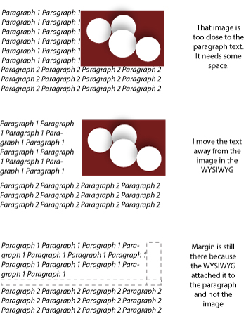
The first thing to know about HTML is that there are many ways to do the same thing. For instance, let’s say that I want to add space around an image so that the text isn’t butting right up against it. In HTML, I could increase the “margin” around the image OR
Increase the margin around the text OR add some non-breaking spaces OR put it in a table and increase the “cellspacing” OR a whole host of other things to give that image some breathing room from the text. When I’m using a WYSIWYG editor, though, all I see is space between the image and the text. It has to guess which technique I want to use.

This can cause problems down the line.
For example, in the WYSIWYG, I’m just visually separating the image from the text probably with my mouse.
The WYSIWYG interprets this as adding margin around the text.
Later, let’s say I decide I don’t need that image after all. I delete it.
Because the WYSIWYG added margin around the text rather than the image, the margin stays because the text is still there and now the edge of my text has extra white space and doesn’t line up with my other text.
Argh. Because WYSIWIG editors have to guess which of many HTML techniques you want, your email suffers.
Formatting Invisible Containers
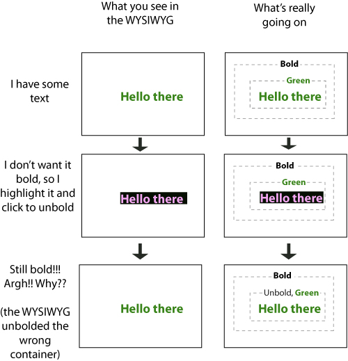
Another basic point to understand about HTML is that it is a language built of containers. In HTML, you define containers and put containers inside other containers. Like tupperware, HTML containers (ideally) fit nicely into one another.
Most of the time, these containers aren’t visible when a browser or email client is displaying the email. The contents of the containers are visible.
In code, to make the contents of the container look a certain way (font size, family and color), you format the container. The problem with this is that when you’re using a WYSIWYG, all you see is the contents because the containers are usually invisible. So if you select some text and click the “bold” button, the WYSIWYG has to guess which container you’re trying to format.
*sighs*

Because WYSIWYGs don’t show the containers that are being formatted only the contents, deleting content in WYSIWYGs, many times, leaves HTML “crumbs” behind. In other words, deleting content in WYSIWYG editors many times leaves empty, previously-used containers that may be formatted a certain way. With all of these invisible, empty, formatted containers lying around your email template, it’s only a matter of time until you place content into one of them without knowing and the format of your text is completely different.
Because of this reality, it’s important to use a fresh, empty template every time you send an email instead of taking a previously-sent email, deleting its contents and inputting new content. Templates provided with email programs are specifically designed to work with that particular program’s editor and quirks. So remember that when you upload or input a new branded template that you have created outside the program, it may not work as well as the templates that the email blaster automatically provides.
Common HTML Email Editor Problems:
Let’s look at some other common problems that people encounter when working in an WYSIWYG editor and why they’re happening:
-
Tables and bulleted lists (sometimes known as “unordered lists” or UL) automatically changing the font family and font size
This is because when you insert a table or bulleted list, you’re actually creating a new container. Depending on your editor, these containers may have specific formatting that is different from the rest of your email.
-
Small images take forever to load when someone looks at the email
When you upload a large photo (think high-res photos from a digital camera) and then resize them in the WYSIWYG, the email will actually load the big picture (and its huge size) inside the smaller frame that you set for it when someone looks at it. Best practice (and courtesy to your constituents) is to resize photos and images before uploading them into your email blaster.
-
Copying from Microsoft Word or “Rich text”
Whenever you’re working in code, whether it’s HTML or CSS or whatever, you don’t want to be copying from Microsoft Word or any other “Rich Text” editor. “Rich Text” as opposed to “Plain Text”. Rich Text allows you to format your text (bold, left align, font family) while Plain Text is just text. The extension for plain text files is .txt while Rich Text is .rtf and Microsoft Word is .doc.
Any text editor that allows you to format text will insert its own invisible code around the text so that the computer knows that it should show it a certain way. When you copy this extra code and paste it into your HTML email editor, it can cause a slew of errors because the editor is expecting only HTML code not rich text or Microsoft Word code. Plain text doesn’t have any of this extra code. It’s simply text. Nothing more.
Before you copy any text into your HTML editor, make sure you first paste it into a plain text editor and see if there’s any extra invisible code floating around. A plain text editor will only show text so you’ll immediately see anything that isn’t the text of your email. Remember that even if the code looks unformatted, it might still have rich text or Microsoft Word formatting code around it.
-
Weird codes like “ show up where there’s supposed to be a character

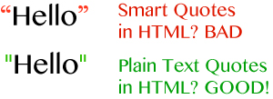
Sometimes Rich Text or Microsoft Word will change certain characters to look more fancy. The most common two examples are quotation marks and ampersands. Some rich text editors will automatically change quotation marks to what are called “smart quotes”. Smart quotes curve depending on whether they are to the left or right of the text. These “smart quotes” replace the plain text ” with a bit of code to make them “smart” so that when you paste the code into HTML, they get pasted as a string of code instead of a quotation mark. This is a big deal because quotation marks are a critical piece of HTML code so that if they are switching to “smart” mode because of your editor, a whole host of things can go to hell because of it.
-
My editor says my file is too big!
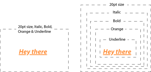
Sometimes you may try to send your email and your editor says that your email file size is much too large. This can be caused by many things but one thing that happens often is that an email created in a WYSIWYG editor creates a new container for every new type of formatting. In regular non-WYSIWYG HTML editing, you can apply multiple formats to a single container.
For instance, if you wanted to make a paragraph have orange, bolded, underlined and italic text that was 20pt in size you would format the paragraph container orange, bold, underline, italic and 20pt font. In WYSIWYGs, many times instead of formatting the same container in multiple ways, it creates a new container for each format. So in our orange text example, it would make a new container around the paragraph and style the new container with underline text and then enclose that container in another container and style it with orange text and then another enclosing those two styled as bold and so on. All this extra, unnecessary code means the file size of your email increases and looks more and more like spam or a virus.

- Embed videos
Alternative: have a screenshot linked to the video page
- Embed surveys
Alternative: Link to the survey with a screenshot
- Flash animations
Alternative: Create an animated GIF
Take-Aways
- Use a plain text editor (Notepad in Windows, TextEdit in Mac (make sure in the preferences that you’re editing in TXT and NOT RTF)
- Use a fresh template for every new email. Don’t copy a previously-sent email and delete its contents.
- Resize your images before you upload them
What are your experiences using WYSIWYGs for HTML Emails?


Recent Comments