
The first rule of email messaging as an organization is that no one reads emails. People skim emails. Making your email blasts as skimmable as possible is the best way to get your point across to the people you are trying to reach.
When it comes to email newsletters, skimmability becomes even more necessary as your Executive Director adds 8 new content pieces each with a dire “ask” for your poor, weary, sleep-deprived, email-inundated readers. (I can add more adjectives if you’d like)
A few standard tips go an incredibly long way to make your newsletter more skimmer-friendly.
-
Headers
Who doesn’t like larger, bolder text? Lame-Os, that’s who. Headers, whether using the official HTML tag or not, are a great way to break up a large amount of text. Usually bold and a larger font size, they pop out and summarize the section underneath. Readers can pick up the main ideas of the content quickly and easily by skimming the headers. As icing on the cake, search engines like Google put extra emphasis on terms used in HTML headers, so if you’re archiving your emails on your website there’s extra incentive to use them. #winning for everyone.
-
Read More Links
At Aspiration, we always emphasize having a measurable goal when using communications tools in order to track your progress (and determine whether or not the tools are worth your time and resources). Well, if one of your measurable goals is to drive more traffic back to your web site through your emails, a “Read More…” link (include elipses according to taste) kills two birds with one stone. Writing a shorter content piece in the email makes your email shorter and more skimmable while the Read More link redirects interested readers to your web site to read the full piece. People who don’t care don’t have as long to scroll through and people who do care go to your web site, get the information they’re looking for all the while driving up your web site traffic.
-
Side-Bar Pull-Outs
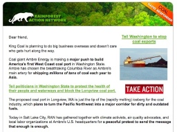
One way to make your emails much more “to the point”, is to pull out the essential information along with the “ask” into a sidebar. The sidebar consolidates the necessities ideally with bright colors and buttons near the top of the email. For the uber-ADD, they can open your email, see the bright shiny buttons with a simple ask, click, contribute and be on their way. No unnecessary reading necessary. This also keeps the must-have information of the email above the “fold” or the area of the email immediately visible without scrolling down. This golden zone is the sweet spot of people with no attention span (i.e. email readers).
-
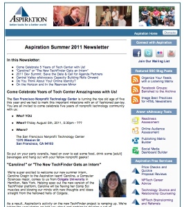
Table of Contents
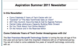
Even if your email is chock full of Headers, Read More links and cute buttons pulled out in the sidebar, it might still be hella long. Let’s face it, there is a lot to tell your email readers and they need to know NOW. The best way to class us your email newsletter and take it to the next level is to include a table of contents. Usually, in your email program this is done by inserting an “anchor” in front of the text of each Header throughout your email. Then, create a link at the top of your email to the corresponding anchor. If you’re an HTML geek like me, it would look something like this:
<h1>Table of Contents</h1>
<a href=”#chicken”>Great Chicken Recipes</a>
<a name=”chicken”></a>Great Chicken RecipesTable of Contentseses tell your reader everything that is in your newsletter without telling your reader everything. They also make navigating through the email much easier and give your email essential information in that golden “fold” zone. Friends don’t let friends build email newsletters without Table of Contents…
Happy Emailing!
When doing any kind of organizational email blasting, it can be a big job with what seems to be a little payoff. I hope that these tips for making your email more accessible and user-friendly will help you work toward your measurable goals around using email for your organization.
::Thumbs Up::


Recent Comments